Taki Matcha Branding
Taki Matcha
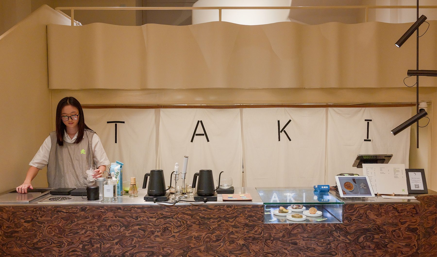
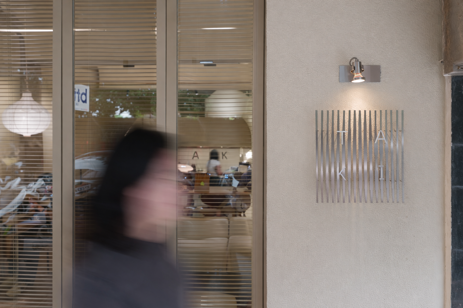
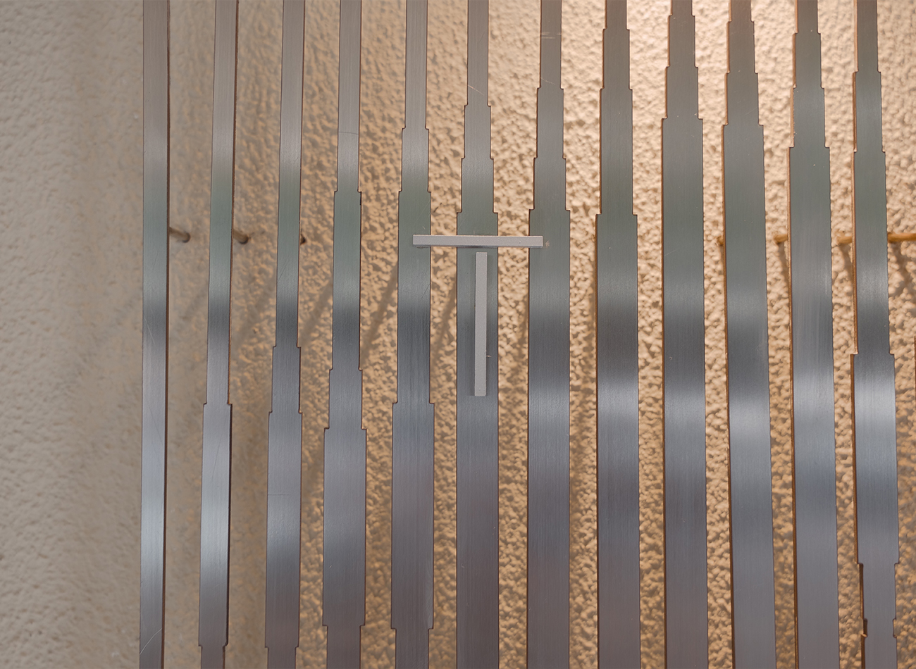
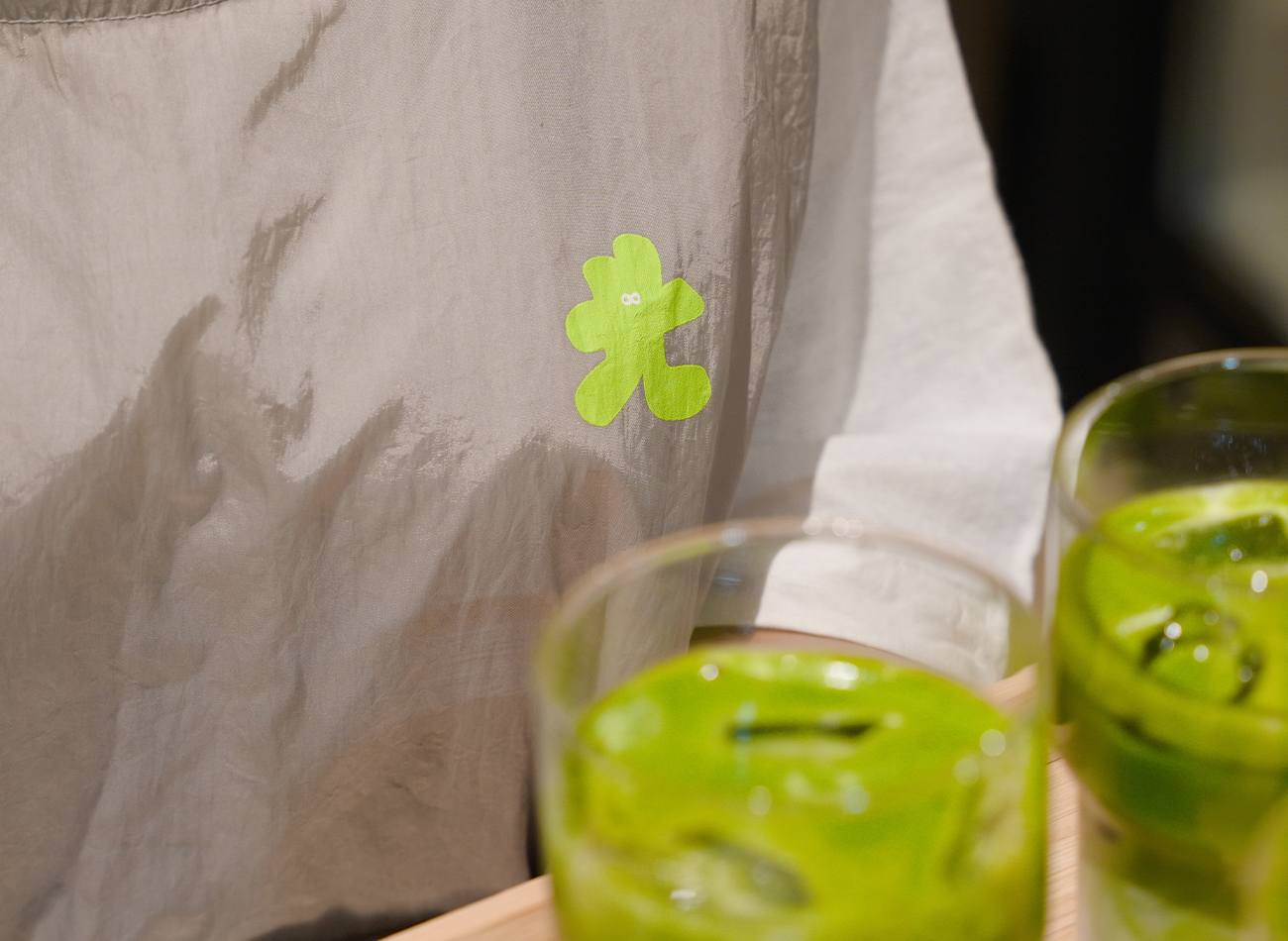
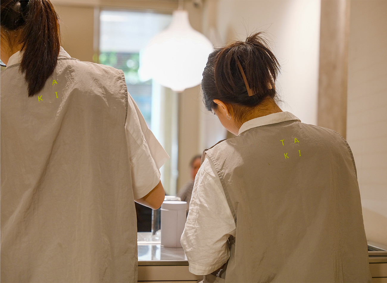
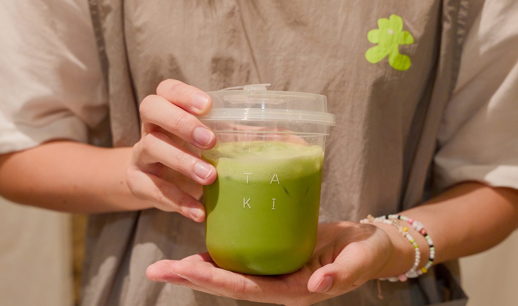
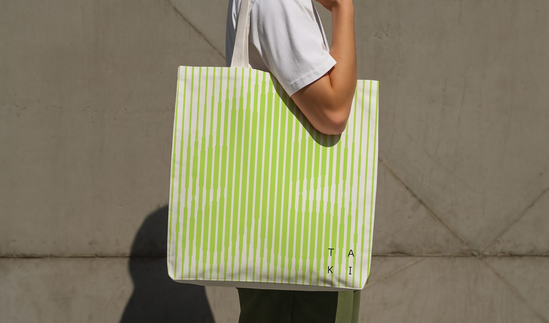
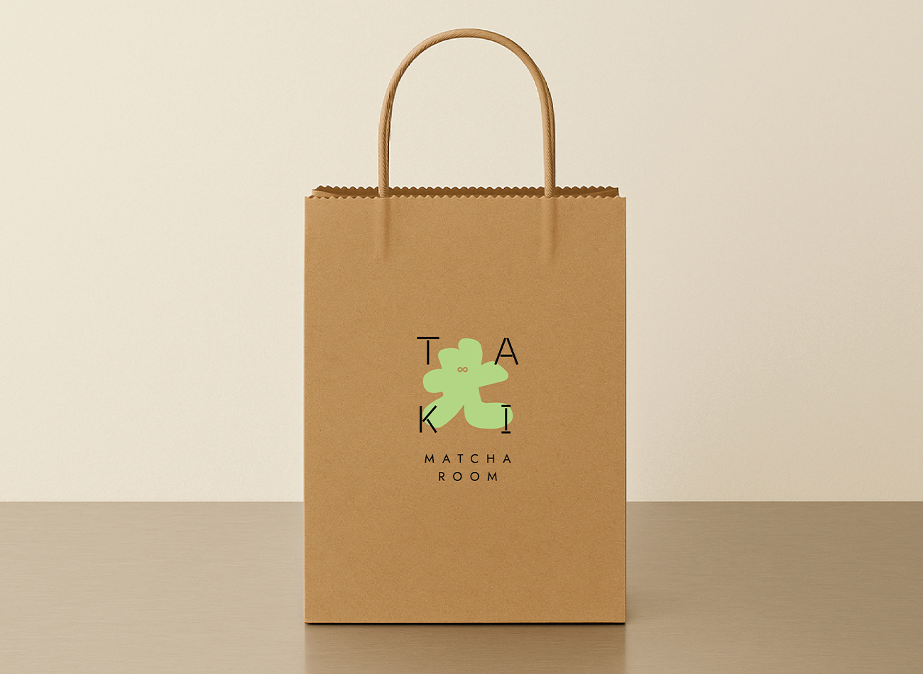
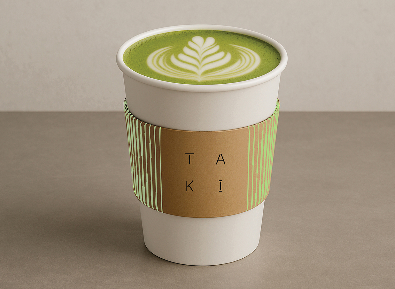
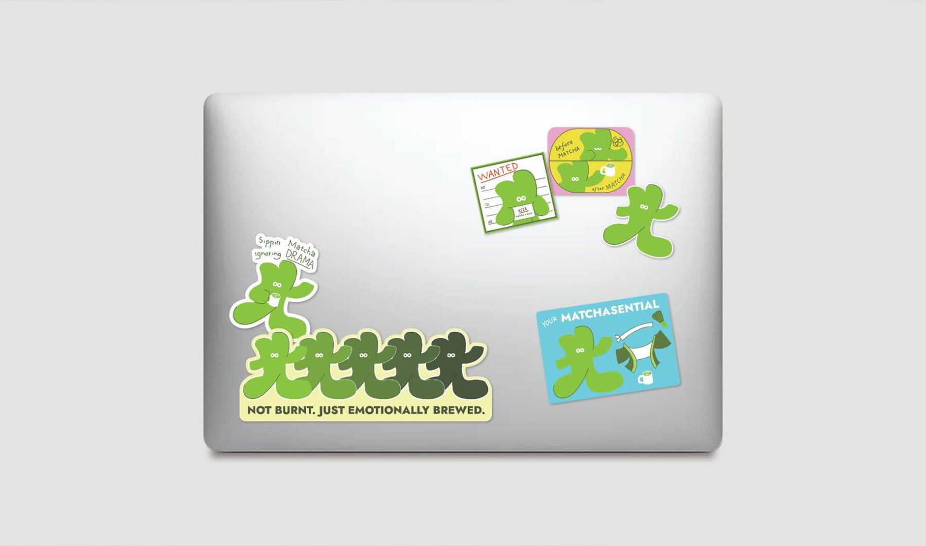
Taki is an artisanal matcha tea room tucked inside Dwellingpals Space, Bandung. Dedicated to authenticity, it serves premium matcha drinks crafted from powders sourced across Japan. The name ‘Taki’ is an anagram of ‘Kita.’ In Japanese, ‘Kita’ means ‘north,’ pointing to its location in northern Bandung, while in Indonesian, it means ‘us,’ representing the passionate team behind the brand. KUDOS created Taki’s brand identity—its logo and supergraphics inspired by the fluid motion of whisked matcha and the whisk itself. Alongside the logo is Kita, Taki’s cheerful mascot shaped after the Japanese kanji for ‘Kita’ (北). Playful and versatile, Kita can transform into many forms.
Since opening, Taki has quickly become a go-to destination for both locals and tourists—whether it’s for a calming tea ritual, a cozy catch-up spot, or simply to enjoy its playful branding and unique atmosphere. It’s not just about the drinks; it’s the whole experience that keeps people coming back.
KUDOS Design Collaboratory
-
Andy Kurniawan
Creative Director -
Owen Febiandi
Lead Designer -
Lisa Andrea Nolwen, Syamil Haqqoni, Wandytjen
Designer